In Uganda if not in most countries today, website designs are mostly responsive now. While some website design agencies and freelancers could still design you a none responsive website, you need to know what exactly a responsive website design is, and why it’s a must have especially for business websites.
We are a website development team dedicated to bringing Uganda first class designs that are stunningly adorable but mostly, we design them with a primary intention to make more sells for our clients. We can’t achieve this task without involving responsive designs, neither can anyone.
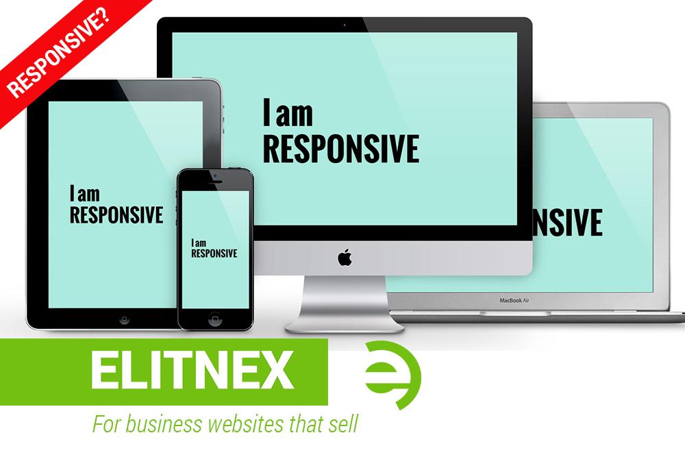
In this article, we’ll look at responsive and its importance. This is just so our current and future clients have a simple and clear understanding of what a responsive website design is.
What is Responsive Website Design?
This is simply a front-end development process, intended for molding website design and user experience to the user’s device, whether desktop, tablet, or mobile — The concept can also be called “Mobile Friendly” designs.

In responsive designs, we have to introduce a setting that defines the format and layout of web pages to detect and respond to different device’s width respectively. This then allows your website to scale and change design upon the device’s browser width size.
Principles of a Responsive Website Design
There are currently two major principles that govern responsive designs. These are breakpoints and fluid scaling.
What are Breakpoints
These are conditional boundaries at which the width of specific device’s browser triggers different styles respective to the device width size.
Break points are defined in a cascading style sheet (CSS)—essentially what defines the design and layout of webpages. Breakpoints can be set at any size but they tend to align with the most common device dimensions of each Desktop (1200/960px), Tablet Portrait (768px), Mobile Landscape (480px), and Mobile Portrait (320px). Today, a technology continues to advance, industry standards are constantly changing as new devices are released.
The science behind Fluidity.
Fluidity in Website Design refers to the use of percentage or em values to permit a website’s container elements to scale within the bounds of its parent elements, and ultimately the browser.
Fluid scaling is necessary to achieve responsiveness between breakpoints, to maximize responsiveness.
Conclusion;
Today, as internet users are constantly “on-the-move”, the majority of website visits (Traffic) is mostly from mobile devices, and this is increasing every day. This shows you how important it is to optimize your website accessibility and user experience on smartphones, tablets, and every device imaginable.
Surely, this cannot be done better than having your website Responsively designed to adopt to any screen size.
At ElitNex, all our designs are all responsive to any screen size imaginable. Our development team performs checks of all major browsers and screen widths and so your audience will be able to engage seamlessly with your website regardless of their respective devices in use. we are world, in Uganda
Do you need help with internet marketing for your business?