Beauty lies in the eyes of the beholder’, Your website design is judged by your website visitors – Ugandans (the ones you care more about), rather than you as the website owner.
A poorly designed website can lead to a lot of pain and hard work gone to waste. Poor website designs are usually characterized by Very Low Analytics metrics like high bounce rates, low time on site, low page views and worst of all, very low conversions. It’s not just about slapping your web pages to the internet any more, nor is it having a pretty looking front page, it comes down to how “easy to use” your website is, what colors your website has among others.
There are many factors to consider while making your website, especially if it’s made in Uganda, for Ugandans. Sometimes these factors may change in accordance to the kind of website you need and geographical factors. The top 5 I’ll address today will serve in most cases.
1. Purpose
One of the most important factors of website designs is to have a good and clear purpose for web pages.
Are your website visitors looking for information about your business, making a transaction with your business? Your site visitors are always looking for something, even before they come to the website. And that’s what you should be looking out for. Each of your pages should have a clear intent of what you want the visitor to know, or do.
2. Speed (Load time)
We all love “Speed, Fast, Quick”, No one wants to visit a website that takes too long to load just one of its pages. By all means, the load time heavily influences the quality of a website design.
Sometimes load time can be an internet or server bandwidth problem so you may not need to obsess about it as much, but a website’s load time can be improved with a series of techniques, among which include image size optimization, code optimization and compression etc.
3. Mobile Friendly
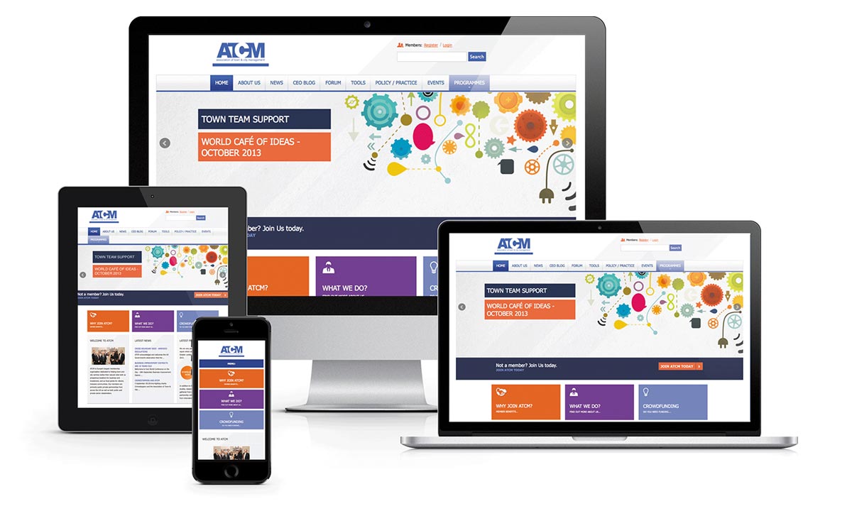
In Uganda, over 70% of website visitors are on Mobile Phones and Tablets, especially in Kampala which takes up over 60% of the total traffic, your website needs to be on mobile too (this means it will adjust its design to different screen sizes on multiple devices).
Your website by default will not reject small devices like phones and tablets – mobile friendly or not, but the reason to making it mobile friendly is so you can give ease of navigation through your website for visitors on mobile.
A good and well optimized mobile website can make excellent conversions of your visitor to customers.
4. Search Engine Friendly
You want your website to be found by google, Always. Unless you’re not a business that needs to be noticed by the internet, your website should be optimized for search engines. A good Search Engine Friendly Website can also lead to an increase in conversions from visitors delivered by search engines.
Search Engine Optimization (SEO) is a term widely used by digital marketing agencies as the process of affecting a search engine results page with your website pages for a list of targeted words or phrases typed by the searcher.
A good website design doesn’t have to be highly optimized, but should at least have a search engine friendly frame work and set off some SEO good practices like having H1 tags, removing or Controlling duplicate content etc.
5. Usability
This is one of the most important qualities to check for in a website design. A website’s usability comes down to how good your website is at keeping visitors around, how good it is on converting your visitors to customers, what impressions it gives to the visitor and a lot more.
Below is a bulleting of some basics to having a good usability score on your website.
-
Your content should be organized in a Grid based layout – sections, columns and boxes.
-
Placing random content randomly on your pages makes the website appearance messy and just won’t take you or your business anywhere.
-
People on the internet tend to have this need for quick service, so it is important to communicate with fast, clear and easy to digest messages.
-
Organize your information with headlines, sub headlines, bullet points instead of long sentences
-
Use good and easy to read fonts plus a good font size for your visitors.
-
Use well thought out colors for your kind of website to enhance the usability.
-
Pictures speak more than words alone, and choosing the right ones can go a long way to entice sells on your website.
-
The use of infographics and videos is also a good and creative way to communicate your message to visitors.
-
Maximize menus and buttons on your pages to ease navigation for your visitors around the website.
For a good website design, contact us or check elitnex.com
Do you need help with internet marketing for your business?
